Developer Onboarding: PusherAugust 31st, 2016Cristiano Betta9 minute read
This is the second in a series of articles focussing on reviewing Developer Onboarding. Have a look at the first post reviewing SendGrid.
Criteria
I will be looking at 3 aspects of the developer onboarding experience:
- Exploration: Does the experience help me to understand or try out their product before signing up for an account?
- Onboarding & Integration: How well does the product guide me from their main site to create an account and to make that first API call or integration?
- Reference: Once I have my first integration in place, how hard is it to find the full reference documentation for the API call I made?
Pusher
Build Apps, Not Infrastructure.
Pusher is a cloud-based tech platform enabling developers to create collaborative tools, multiplayer games, chat and real-time dashboards. Founded in 2010. - CrunchBase
Pusher are a well established brand, have been very developer focussed for years, and they have a reasonably good reputation with developers.
Exploration
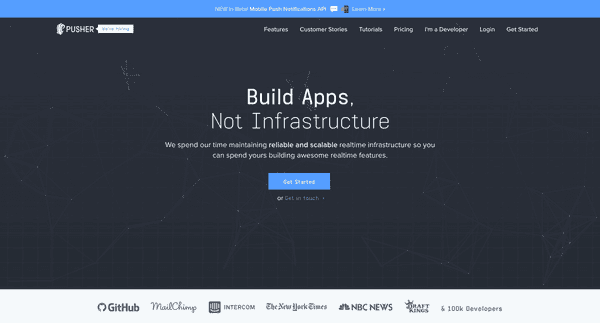
Pusher's landing page is very simple and sparse. Their slogan probably does wonders for SEO but it doesn't really help explain to a developer what they do. I suddenly spot the I'm a Developer link at the top.
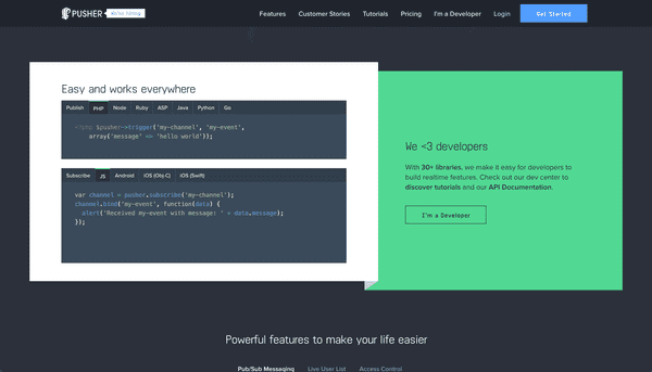
Before I click this I decide to scroll further down and notice that Pusher does <3 developers.
This code sample does a great job of making me understand what Pusher is about. They call out two main actions: publish and subscribe.
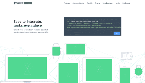
I can't run any of thise code here directly but I do get presented with a now even bigger I'm a Developer link. I click it.
I see a cURL command so I open up my terminal an paste it in and run it.
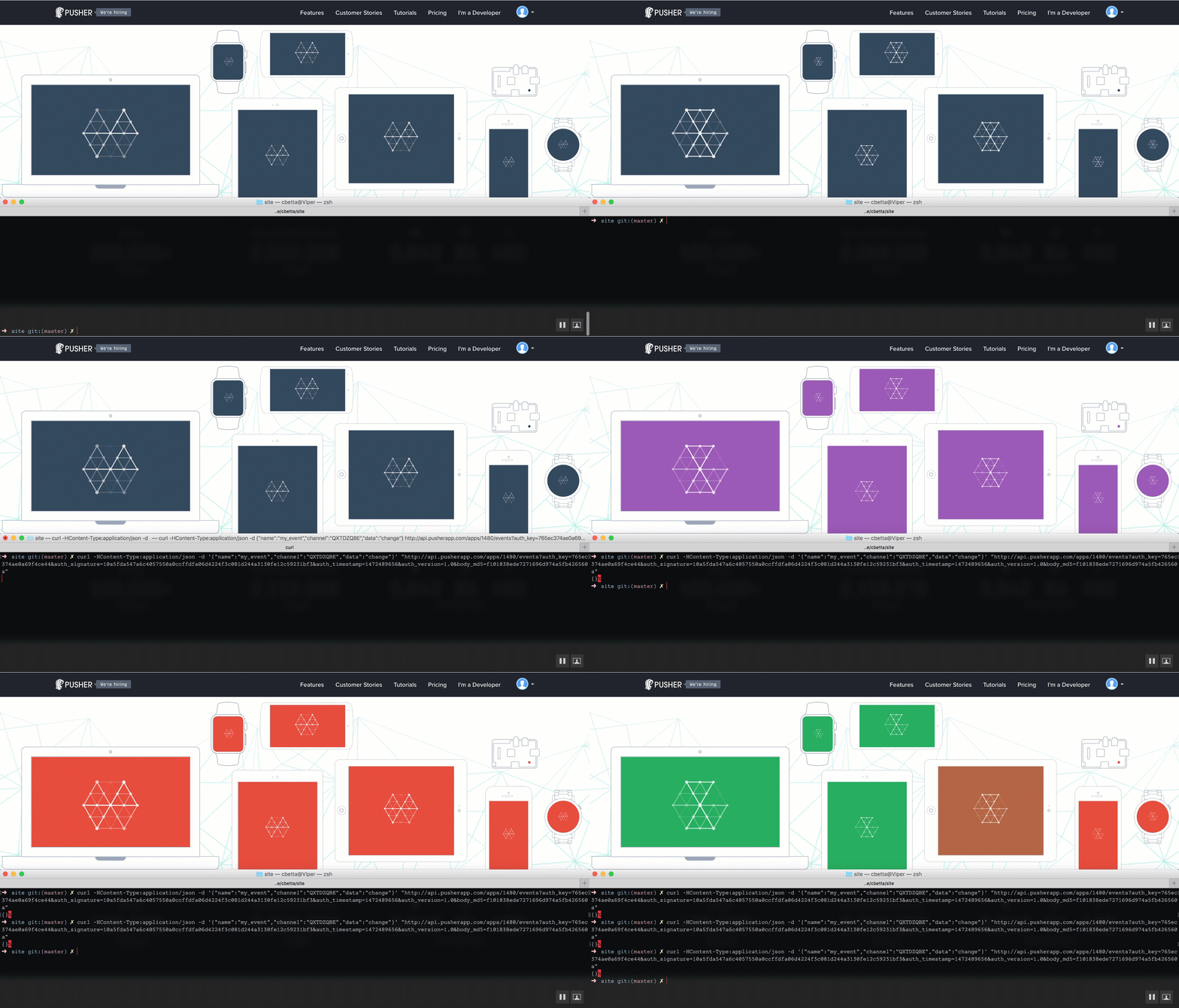
Whoa! The colors changed! I give it a few more tries to ensure this was indeed me. I start to see the point: push anything anywhere.
Onboarding
Now that I'm convinced I want to use Pusher I hit the Get Started button at the top.
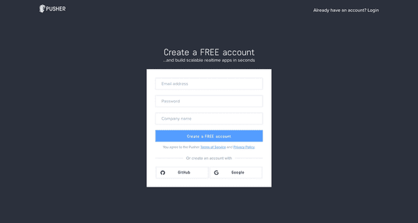
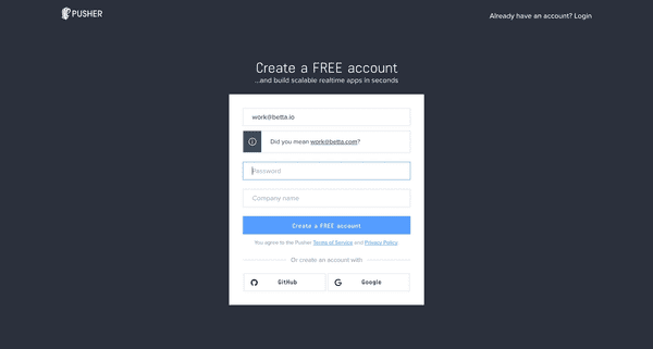
Good to see I can create a free account. It's always good to know I won't be asked to add my credit card details just yet. I fill in my work email address and notice a subtle warning.
I didn't make a typo but the amount of people that can't type their own email address correctly always surprises me so these kind of checks help people from making simple mistakes.
I fill in the rest of the form and continue.
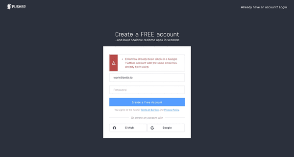
Now this is very odd. Pusher seems to check my email address against the Google/Github APIs and won't let me login with it here if I already have it tied to Github or Google account?
I try a different email address instead and the form submits.
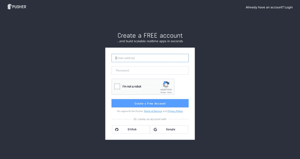
This form had me extremely confused . The button says Create a Free Account - but I thought I just did?! Additionally it suddenly has a reCAPTCHA and only one password field. I got so confused here I went back all the way to the start and started over again with yet another different email address.
I again ended up on this page and I made a guess: this is a login form. I typed in the email address and password that I chose for registration, verified that I'm not a and hit the big blue button.
Integration
Yay I'm logged in!
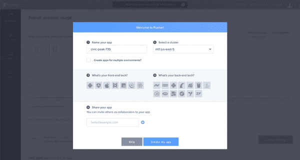
Although the signup was a bit confusing this first login screen is amazing. This is one of the best first-use experiences I've seen.
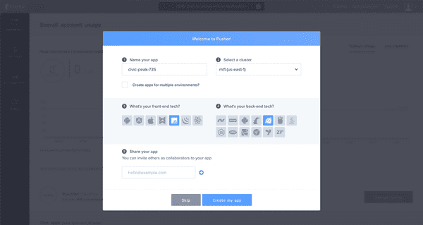
Pusher realises that as I'm new I probably want to create my first app. Additionally they want to help me start integrating so they ask me for my preferred front- and backend languages. I pick Javascript and Ruby.
I create my application.
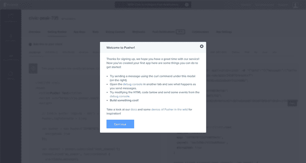
Before I get to continue Pusher informs me of some more useful links like their Debug Console and their Documentation. I open all of these links in new tabs and continue.
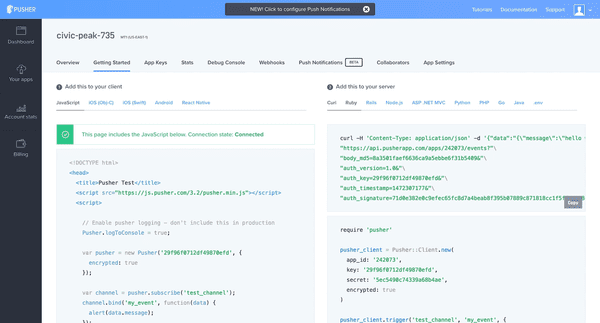
Because I chose my prefered languages Pusher is now able to give me detailed sample code right on my dashboard - allowing me to get started as quickly as possible.
What's really nice is that the code samples already have my API key and secret embdedded into them.
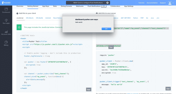
I copy paste the cURL command into my terminal and run it.
Nice, they integrated the push events into their dashboard. A slight annoyance here is that I did get 2 popups as I also had the Debug Console open in another tab, but I can live with that.
Reference
The cURL command returned an empty JSON hash.
{}I know the command was successful because I received the alert in my browser, but I'm still interested in the full API reference documentation including expected responses.
I spot a Documentation link in the top of the dashboard and click on it to end up on the documentation root.
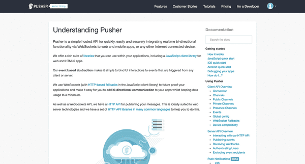
Somehow this feels like an underwhelming page compared to what I've seen from Pusher so far. There's little structure to this page - just some text, an image that doesn't help me understand anything, and a very unstructured sidebar navigation.
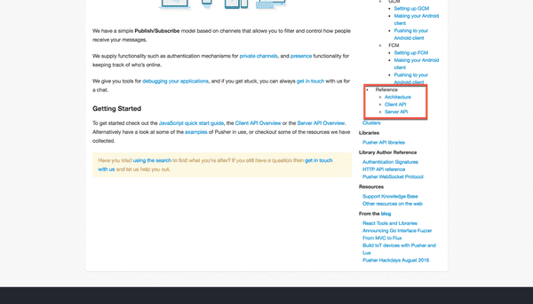
I'd expect a mention of a "reference" and find a few at the bottom of the sidebar.
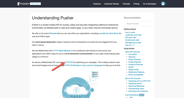
It doesn't link me really to what I want though, these pages do not keep exact reference docs. In the end it turns out that this link is what I wanted.
I actually clicked on it by chance and ended up on this page.
https://pusher.com/docs/rest_api
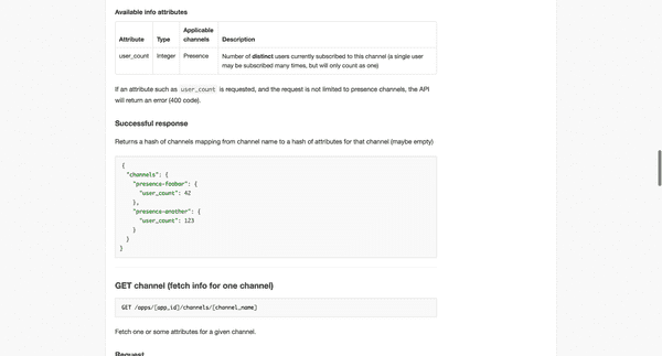
This page holds the exact request and responses for most API calls. I have to admit this page still doesn't feel like a complete reference documentaiton but it has more detail than the pages actually labeled reference in the sidebar.
Emails
I want to quickly highlight the emails that Pusher sent me while I signed up. None of these were necessary to get started but they nicely round out the onboarding experience.
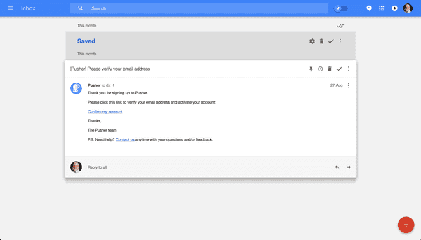
The first email is the confirmation email.
It's a simple straightforward text email with 1 call to action and a link to get in contact if you need any help. This pretty much covers every main usecase for someone onboarding.
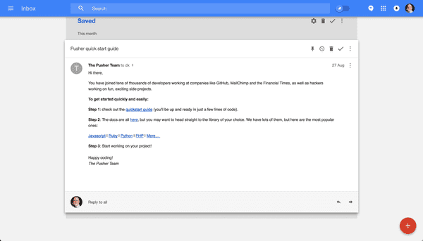
The second email is an additional email pushing me (no pun intended) to get started with my first integration.
This email might seem redundant - with the great first-use experience that Pusher offers - but it's extremely useful for anyone who did not have the time to complete that first integration for some reason. It allows people to quickly come back to the right point to create their first integration.
The only minor note of dissapointment is that the Quickstart Guide link doesn't link me back to the same experience we saw on first login on the dashboard, instead it links me back to the rather underwhelming docs.
Conclusions
★★★★
Almost flawless
Pusher is an example of a developer product that has to teach developers how to use their product on both the frontend and backend. They have to to solve the problem of onboarding a developer in not just one but two programming languages! Pusher's first-use experience is an excellent example of how to solve this problem with as little friction as possible.
The good
-
A great first use experience
- It helped me set up my first app, allow me to get my API credentials
- It allowed me to pick my frontend and backend languages
- It provided me with code samples for the frontend, backend, and a cURL sample
- The code samples already had my API key prefilled
- A free plan allowing me to try out their product before paying
- A way to test the application before committing to an account
- An excellent follow up email to get me back to integrating if I somehow left the onboarding flow
- It took 0 clicks to get to a first code sample, as there's one right on the homepage
The bad
- The flow from registration to login had me very confused, and I'm still not sure if this is a bug or not.
- The warning about my email address already being in use with Github/Google might have been beneficial to them but the error message did nothing help me proceed to the next step.
- The developer documentation seems unstructured and occassionally incomplete. It's an underwhelming experience that requires an experienced developer to be able to find the right pages required.
Next
That's it for this second post on Developer Onboarding. Let me know in the comments below what you think of this post and if I should continue. I'd also love to know what company you think I should review next.

